Colour
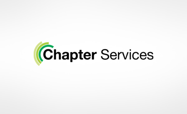
The colours are shades of GREEN and simple BLACK in a WHITE background.
Green
Shows certain aspects of
- Long-term focus
- Renewable nature of relationship- repeating clientele
- Friendly – to the eye (so to the clients)
- Natural- shows the CSR commitment of Chapter services
Black
Basic, jet black to focus on trust, dependability and simplicity of services.
White
The white back ground provides a nice contrast to the color elements thus highlighting the basic color scheme.
It also depicts the articulate clarity and clean corporate governance.
The shape of the logo is rectangle in a 1:3 height-to-width ratio. Inside that text is in Alte Haas Grotesk font in intermittent bold
and regular text size. Bold text is used to highlight the name. It also shows the flexibility and adaptability of services.
The shape inside is in a semi-circular form in varying degrees of interlocking. It again provides a nice contrast for an
amalgamated feeling. This shows the synergy between the various services CHAPTER SERVICES provide.
Black implies that the services are kept simple yet solid so that replicating that in a scaled up manner would be easy on the
system.
White background shows the corporate transparency and the open nature of the relationship with clients.
Green adds on to the contrast between Black and white for 2 reasons.
- It takes out the blandness out of the logo and adds some zing.
- It implies that Chapter Services is into different domains of services industry.
The 3 interlocking semi-circles in the logo shows there are different verticals which are different- shown thru the difference in
shade and the slightly displaced positioning
It basically depicts the 3 major verticals,
- Manpower- HRM, Head hunting, recruitment, outsourcing etc
- Technical services
- Other services.
Chapter services are in bold showing the solid nature and thorough systems on which the firm is based on. The “services”
part is in regular text to imply that the services are flexible and adaptable.
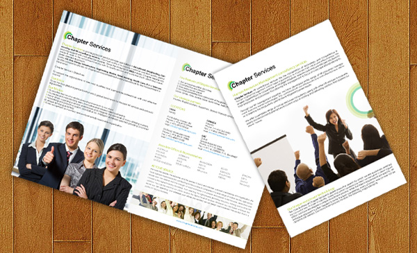
The logo is kept simple intentionally to create an easy recall of the logo. At the same time it is distinct enough to stand apart in
any space, whether it is a website, a brochure or a poster/banner.
It is also kept simple for the accurate and easy reproduction.