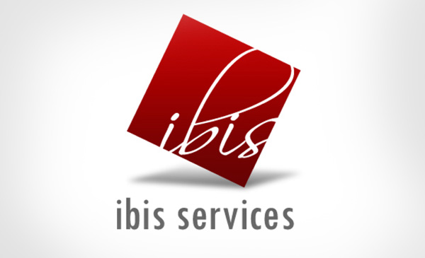
Design is a pseudo-kite design which is a square, which is turned at the left towards the
sky creating a sharp pointer towards the sky. It shows the growth ambitions of the
enterprise.
The color cherry red has a gradient towards the top; this too symbolizes the growth
trajectory.
There is a shadow lurking underneath which shows the corporate social responsibility; the
firm standing strong on the responsibilities towards the society.
The font inside the 'kite-design' is peeping out of the frame and merging smoothly with the
white back ground epitomizing the adapting and versatile nature of the firm in providing
diversified services in line with the clients' requirements.
The design is also a free-style adaptation of a box where the box is tilted; this shows the
creative side which 'thinks out of the box'.
Meaning
Being a eye-pleasing design all-in-all, the logo also shows what the firm stands for, viz.
versatility, creativity, growth oriented and visionary.
Color
The most dominant color in the logo is cherry red. With its white background the color of
the logo stands out leaving you with a deeper impression of the color. This will revolve
around the focus of your Company.
Look at the logo a little deeper and you won't miss the gradient which gradually gets
brighter and brighter as you move towards the top. This signifies the growth of your
company.
Font
The font is in white, which will stand out in the red background and will create a synergy
with the back ground too merging smoothly with the back ground where creating a
merging point with the back ground of white and the logo in red.
It is a flowing design where the letters from I to S - it shows the smoothness of the
operation.